template
Explore creation
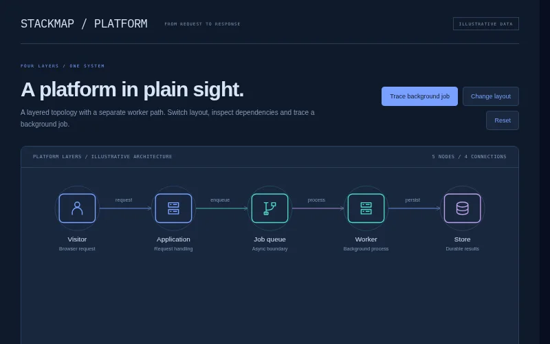
A slate-blue platform map that connects visitors, an edge layer, services and storage with readable labe…
A soft teal community lounge with room cards, editorial member notes and a simulated room join state without requesting microphone access.
<!-- Original layout, SVG/CSS artwork and JavaScript © 2026 XXC Templates. MIT License.
Visual pattern references (original code, names and content; no affiliation):
Discourse Meta: https://meta.discourse.org/
Discussion rows with category markers, reply counts and activity metadata.
Padlet: https://padlet.com/
Visual collections, note walls and flexible arrangements for community contributions.
Illustrative sample content and data; no real accounts, payments, reservations or messages. -->
<main>
  <header>
    <b>tidepool <span>◌</span></b>
    <nav><a href="#rooms">Rooms</a><a href="#notes">From the community</a></nav>
  </header>
  <section class="lounge-title">
    <small>A QUIETER KIND OF CONNECTION.</small>
    <h1>Come as you are.<br /><i>Stay for the conversation.</i></h1>
    <p>Thoughtful rooms for people with things to share.<br />Listening counts as being here.</p>
  </section>
  <section id="rooms">
    <div class="room-head">
      <h2>Around the pool</h2>
      <span>ILLUSTRATIVE ROOMS</span>
    </div>
    <div class="rooms">
      <article style="background: #d2e1d9">
        <span class="room-orbit">◌</span>
        <h3>The making room</h3>
        <p>What are you working on today?</p>
        <div>
          <span>12 sample listeners</span
          ><button id="change" data-room="The making room" aria-pressed="false">ENTER ↗</button>
        </div>
      </article>
      <article style="background: #e6ded1">
        <span class="room-orbit">☼</span>
        <h3>Slow Sunday</h3>
        <p>A little space to think out loud.</p>
        <div>
          <span>8 sample listeners</span
          ><button data-room="Slow Sunday" aria-pressed="false">ENTER ↗</button>
        </div>
      </article>
      <article style="background: #d9dceb">
        <span class="room-orbit">≈</span>
        <h3>The listening corner</h3>
        <p>Music, memories and the spaces between.</p>
        <div>
          <span>16 sample listeners</span
          ><button data-room="The listening corner" aria-pressed="false">ENTER ↗</button>
        </div>
      </article>
    </div>
  </section>
  <aside id="notes">
    <span>FROM THE COMMUNITY</span>
    <blockquote>“Sometimes the most useful thing is a conversation without an agenda.”</blockquote>
    <p>— a fictional member note</p>
  </aside>
  <output data-status aria-live="polite"></output>
  <footer class="demo-note">Fictional brand · local interface demo · no information is sent</footer>
</main>
* {
  box-sizing: border-box;
}
html {
  scrollbar-gutter: stable;
}
body {
  margin: 0;
  font:
    14px/1.5 Arial,
    Helvetica,
    sans-serif;
  background: #fff;
  color: #202622;
}
h1,
h2,
h3,
p,
figure {
  margin: 0;
}
main,
section,
article,
aside,
header,
nav {
  min-width: 0;
}
button,
input,
select,
textarea {
  font: inherit;
  max-width: 100%;
  min-width: 0;
}
button,
a,
input,
select,
summary {
  touch-action: manipulation;
}
button {
  cursor: pointer;
}
a {
  color: inherit;
}
img {
  display: block;
  max-width: 100%;
  object-fit: cover;
}
svg {
  display: block;
  max-width: 100%;
}
button:focus-visible,
a:focus-visible,
input:focus-visible,
select:focus-visible,
textarea:focus-visible,
summary:focus-visible,
[tabindex]:focus-visible {
  outline: 3px solid #2781da;
  outline-offset: 3px;
}
[hidden] {
  display: none !important;
}
[data-status] {
  display: block;
  min-height: 24px;
  font-size: 12px;
  margin-top: 14px;
}
.demo-note {
  font:
    9px/1.6 ui-monospace,
    monospace;
  padding: 16px 0;
  opacity: 0.75;
}
.sr-only {
  position: absolute;
  width: 1px;
  height: 1px;
  overflow: hidden;
  clip-path: inset(50%);
}
dialog {
  max-width: calc(100vw - 32px);
  width: 480px;
  border: 1px solid #666;
  padding: 25px;
  background: #fff;
  color: #202622;
}
dialog::backdrop {
  background: #0008;
}
dialog h2 {
  margin-bottom: 15px;
}
dialog p {
  margin: 12px 0;
}
dialog button {
  margin-top: 16px;
}
@media (prefers-reduced-motion: reduce) {
  *,
  *:before,
  *:after {
    animation: none !important;
    transition: none !important;
    scroll-behavior: auto !important;
  }
}
body {
  background: #f4f6f0;
  color: #38564d;
}
main {
  max-width: 1100px;
  margin: auto;
  padding: 25px 35px;
}
header {
  display: flex;
  align-items: center;
  justify-content: space-between;
  gap: 25px;
  border-bottom: 1px solid #bbccc0;
  padding-bottom: 20px;
}
header > b {
  font:
    30px Georgia,
    serif;
  letter-spacing: -1px;
}
header b span {
  color: #90b5a2;
  font-size: 26px;
}
nav {
  display: flex;
  gap: 25px;
  font-size: 10px;
}
nav a {
  text-decoration: none;
}
.lounge-title {
  padding: 30px 0;
}
.lounge-title > small {
  font: 7px monospace;
  letter-spacing: 1px;
  color: #89a38e;
}
h1 {
  font:
    37px/1.15 Georgia,
    serif;
  letter-spacing: -1px;
  margin: 17px 0;
}
h1 i {
  color: #729982;
}
.lounge-title p {
  font-size: 11px;
  line-height: 1.8;
  color: #90a08e;
}
.room-head {
  display: flex;
  align-items: center;
  justify-content: space-between;
  gap: 15px;
  margin-bottom: 15px;
}
h2 {
  font:
    22px Georgia,
    serif;
}
.room-head > span {
  font: 6px monospace;
  letter-spacing: 1px;
  color: #91a58f;
}
.rooms {
  display: grid;
  grid-template-columns: repeat(3, 1fr);
  gap: 15px;
}
article {
  padding: 20px;
  border-radius: 80px 80px 8px 8px;
}
.room-orbit {
  display: block;
  text-align: center;
  font:
    50px Georgia,
    serif;
  line-height: 1;
  color: #789b83;
  padding: 12px 0 20px;
}
h3 {
  font:
    21px Georgia,
    serif;
}
article > p {
  font-size: 9px;
  line-height: 1.8;
  color: #83927d;
  margin: 10px 0 20px;
}
article > div {
  display: flex;
  align-items: center;
  justify-content: space-between;
  gap: 10px;
  border-top: 1px solid #91a28d55;
  padding-top: 12px;
}
article > div > span {
  font-size: 7px;
  color: #7c927c;
}
button {
  border: 0;
  background: transparent;
  color: #517e62;
  font: 7px monospace;
  padding: 6px 0;
}
button[aria-pressed="true"] {
  font-weight: bold;
  color: #30503c;
}
aside {
  display: flex;
  align-items: center;
  gap: 25px;
  border-block: 1px solid #c6d4c4;
  margin-top: 25px;
  padding: 20px 0;
}
aside > span {
  font: 6px/1.8 monospace;
  letter-spacing: 1px;
  max-width: 80px;
  color: #9aab92;
}
blockquote {
  font:
    italic 16px/1.5 Georgia,
    serif;
  margin: 0;
  flex: 1;
}
aside p {
  font-size: 7px;
  color: #9aab92;
  max-width: 70px;
}
@media (max-width: 530px) {
  main {
    padding: 20px;
  }
  nav {
    gap: 15px;
    font-size: 9px;
  }
  h1 {
    font-size: 31px;
  }
  .rooms {
    grid-template-columns: 1fr;
  }
  article {
    border-radius: 50px 50px 8px 8px;
    padding: 20px;
  }
  .room-orbit {
    font-size: 40px;
    padding: 5px 0 15px;
  }
  aside {
    flex-wrap: wrap;
    gap: 12px;
  }
  aside > span {
    max-width: none;
    width: 100%;
  }
  blockquote {
    font-size: 16px;
  }
}
(() => {
"use strict";
const $ = (s) => document.querySelector(s),
$$ = (s) => [...document.querySelectorAll(s)];
const status = (text) => {
const el = $("[data-status]");
if (el) el.textContent = text;
};
const escapeText = (s) =>
String(s).replaceAll("&", "&").replaceAll("<", "<").replaceAll(">", ">");
function choose(selector, fn) {
$$(selector).forEach((b) =>
b.addEventListener("click", () => {
$$(selector).forEach((x) => x.setAttribute("aria-pressed", String(x === b)));
fn(b);
}),
);
}
function filter(selector, items, key) {
choose(selector, (b) => {
$$(items).forEach(
(el) => (el.hidden = b.dataset[key] !== "all" && el.dataset.kind !== b.dataset[key]),
);
status($$(items).filter((el) => !el.hidden).length + " results shown.");
});
}
function textList(target, values) {
$(target).replaceChildren(
...values.map((text) => {
const p = document.createElement("p");
p.textContent = text;
return p;
}),
);
}
choose("[data-room]", (b) => {
$$("[data-room]").forEach((x) => (x.textContent = x === b ? "IN ROOM ✓" : "ENTER ↗"));
status(
"You entered the " +
b.dataset.room +
" demo. No microphone access, audio connection or account is used.",
);
});
})();
A slate-blue platform map that connects visitors, an edge layer, services and storage with readable labe…
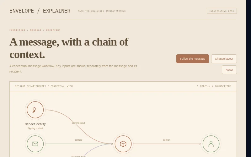
A warm paper diagram explaining sender, recipient and message relationships with key and envelope glyphs…
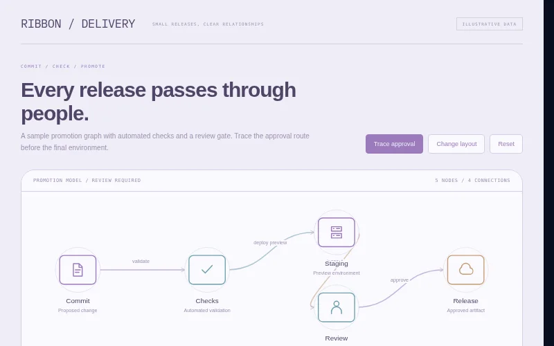
A pale violet delivery pipeline with branch and merge relationships, distinct gates and a selectable pro…